Casa de Puertas
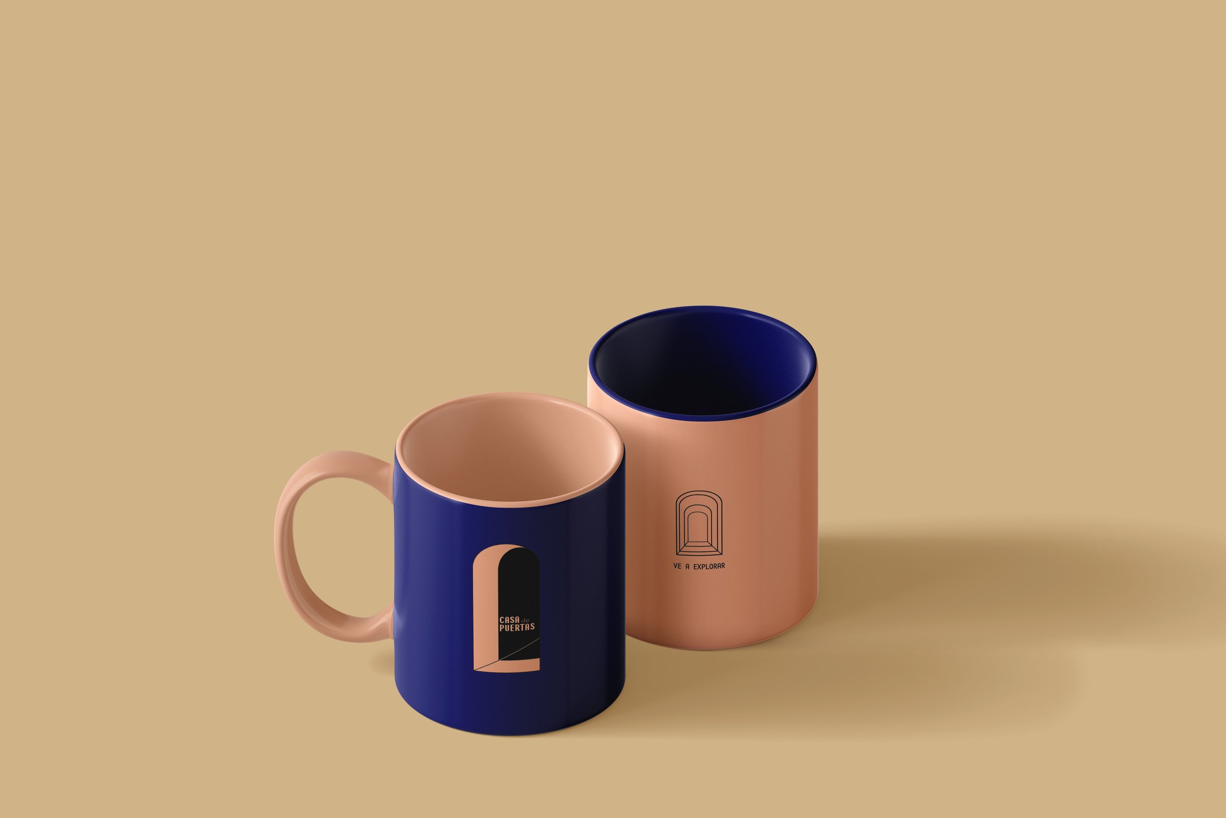
The client behind this brief wanted their customer to feel as though anything were possible within the context of the used book store they were opening. The image of the rounded doorway, inspired by the architecture of Luis Barragan and pulled from the name of the bookstore itself, was central in developing the logo, the color palette, and the emotional core of the store as more than just a place of business, but a portal to endless possibility. Various versions of the rounded doorway were created in Illustrator, with the most paired down version, the rounded arch with a triangle of color in the bottom right corner, ultimately becoming the primary logo for the bookstore. The symbol of the doorway, outside of its association with Barragan, became a natural focal point of the brand with its implicit invitation into the unknown. Neutral desert hues from dune yellow to dusty rose, against a dramatic backdrop of cobalt blue, give warmth to the design elements, welcoming the reader into discovery as they explore the stacks of worn book titles.