PINKFLAMINGO
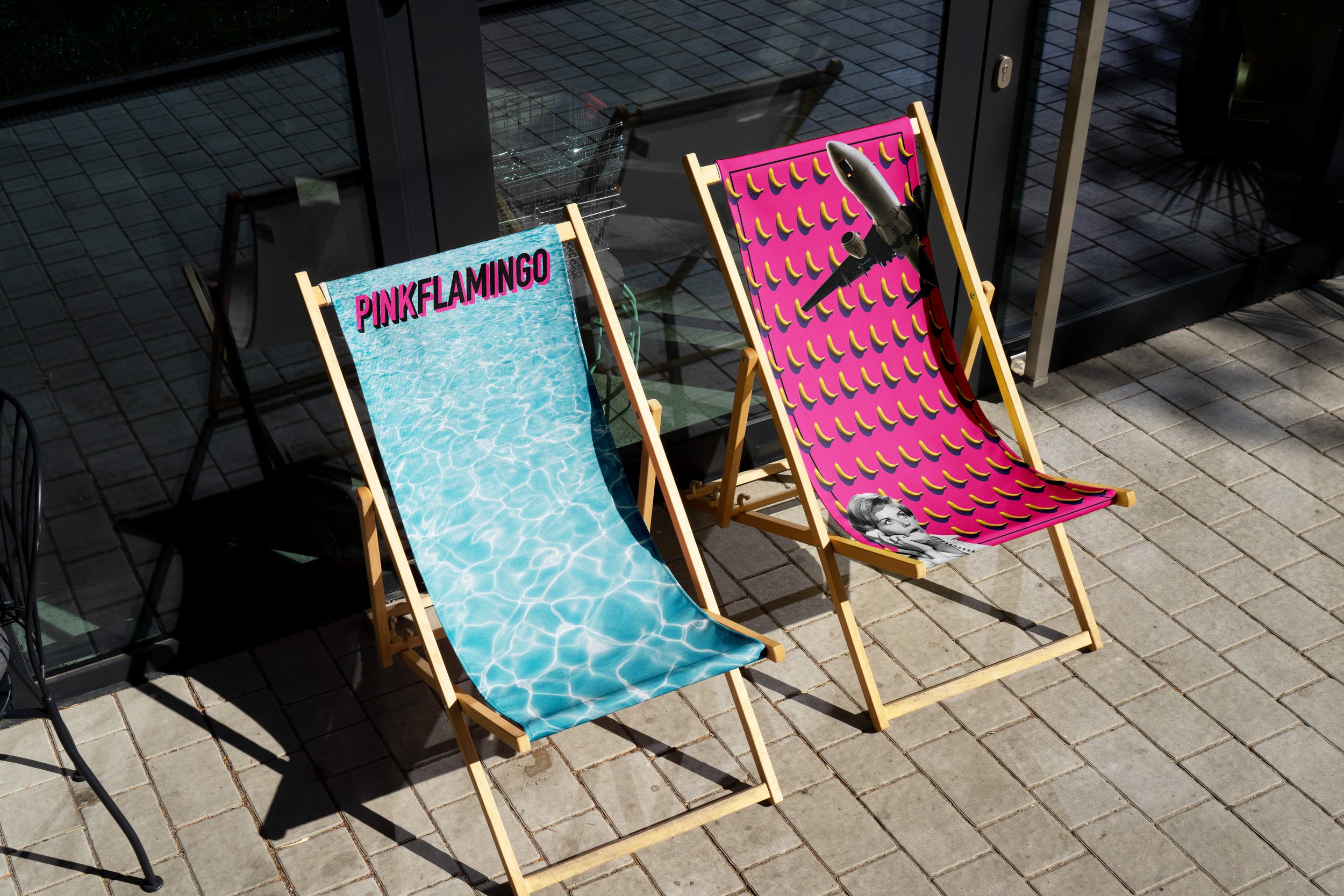
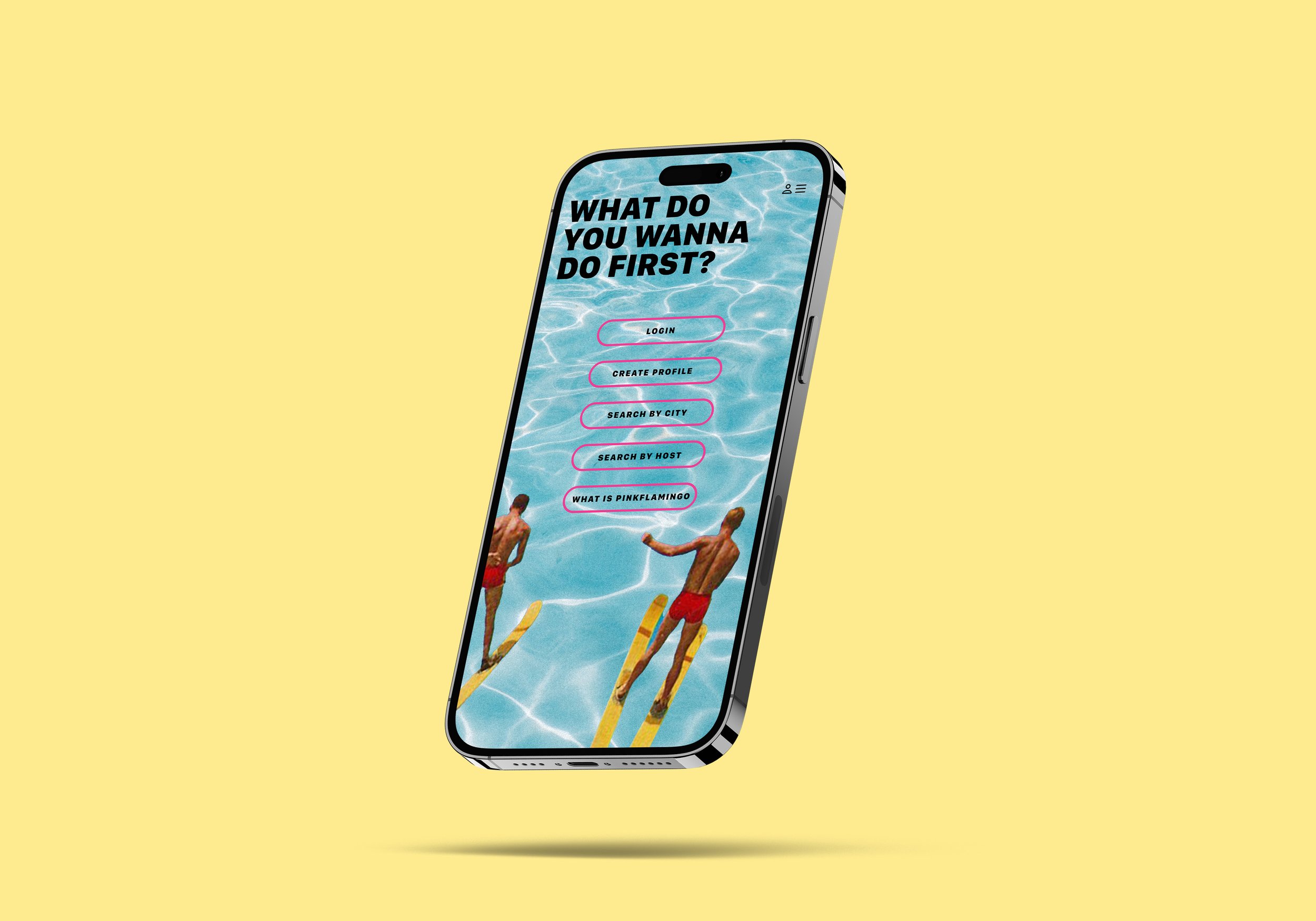
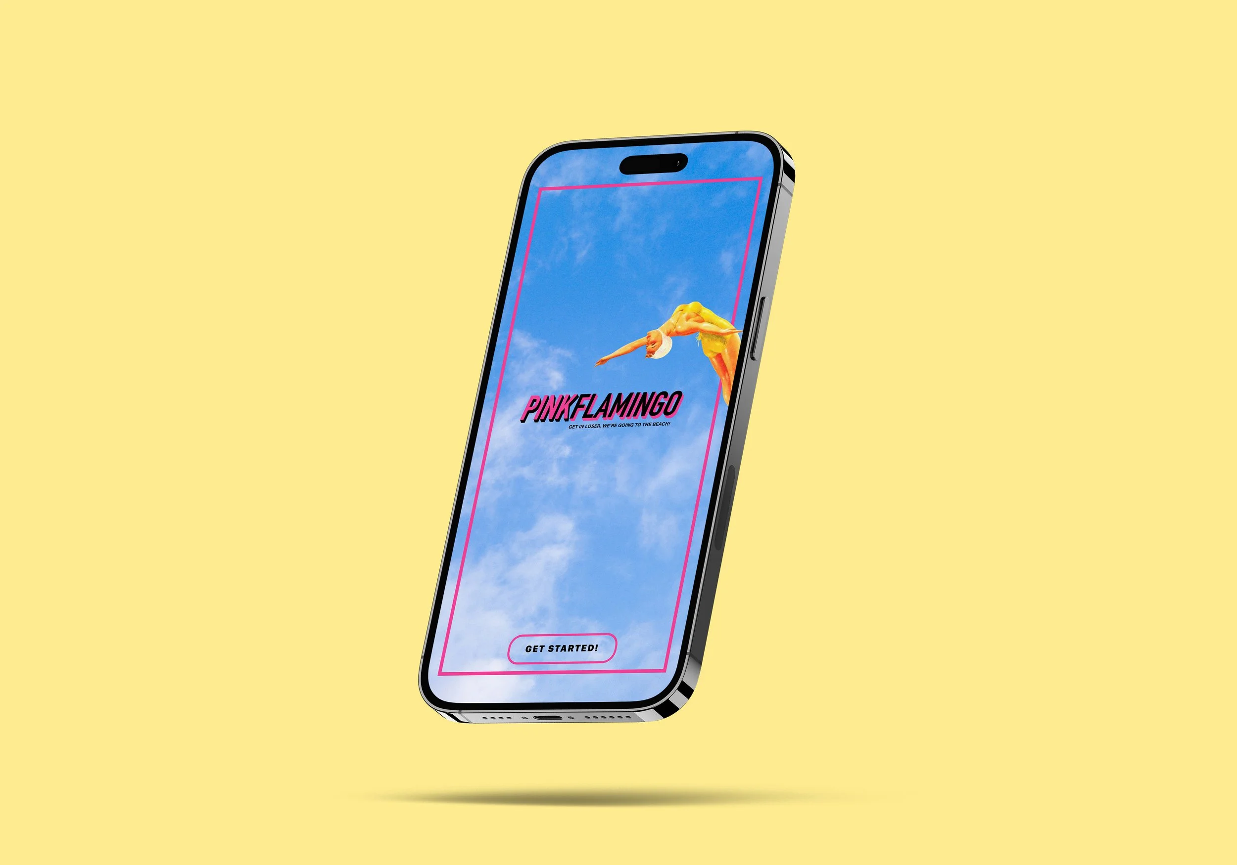
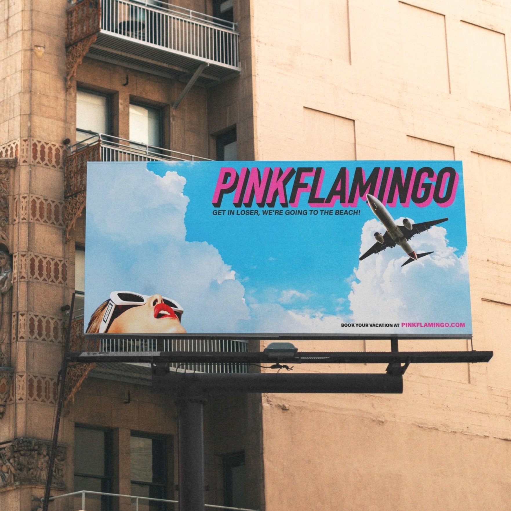
The brief for this full rebrand was to recreate a queer travel booking website and accompanying app in a way that better reflected the energy of the community for whom it had initially been built. While the original company had a muted, clinical palette of whites, blues, and grays, I wanted to revamp the brand by going to the opposite extreme with bright pops of color and the high-contrast of white cut with black. The visual emphasis was campy irreverence, taking cues from the hyper-stylized vacation ads of the 1960s while also paying homage to the unmistakably queer aesthetic of John Waters’ filmography.
